A landing page is basically a stand-alone website you “land on” after clicking a link.
Is it a part of your original website? Is it the page that appears alone when you click on a link that appeared on ads from Google, Instagram, Facebook, or your e-mail?
Google Ads and Google Analytics, refer to any page that you “land on” as a landing page.
Here is the Oxford definition: “A web page which serves as the entry point for a website or a particular section of a website.
Types of Landing Pages
Because the definition is so broad, there are many types of pages that can be classified as a “landing page”. Here are some examples:
- Squeeze Page
- Splash Page
- Lead Capture Page
- Click-Through Page
- “Get Started” Page
- “Unsubscribe” Page
- Long-form Sales Page
- Paid Advertising Page
- 404 Landing Page
- “About Us” Page
- “Coming Soon” Page
- Pricing Page
- “Thank You” Page

The point is, it does not really matter which page it is or even what it is. What makes a landing page unique is its purpose and benefits for your business. And that’s what differentiates the meaning of “landing pages” as used by digital marketers.
What Is the Purpose of a Landing Page?

Landing pages are created specifically for a marketing or advertising campaign in the context of digital marketing. Their purpose is to generate new leads. It is where visitors “land” after they click the link on an ad, e-mail etc. We design landing pages precisely for this first impression. You want to have customers’ attention without boring them with excessive information like on the main page of your website, you want it to be simple so it captures the attention and directs it to your campaign. This is also the difference between advertising your campaign on your main page and the landing page.
Landing Page and Business Goals:

Landing pages capture the attention of the prospect easily and without any distractions, and that makes landing pages one of the best and most useful ways for the new lead generation.
It is this focus that makes landing pages the best option for increasing the conversion rates of your marketing campaigns and lowering your cost of acquiring a lead or sale.
Up to 75% of sales are lost due to a poor landing page experience. First impressions are critical, especially in the digital world, so you need your landing page to simultaneously meet customer expectations, sell your product or service, and communicate your trustworthiness and credibility.
Landing Page Factors to Consider
What makes a landing page successful? We have analyzed some of the successful landing pages and summed up the factors that made them successful. In this list, you will see a few examples of how those factors are displayed successfully on those pages. But first, let’s find out what those factors are and understand each one briefly.
1) Captivating the Attention

Without having their attention and getting them to check out your page, no matter how good you did in the following steps, how much effort you put in, there will be no difference between an undesired spam page and your page; you will be treated the same way, an instant click to close the page. So you have to do a good job designing the page so that it captivates your audience’s attention just in seconds.
2) Creating Trust
If you fail to create the sparks of trust, no matter how shiny your product is, it will crash and burn. So there is a rule of thumb in any sale, create trust. Especially on the internet, where the risk of fraud concerns people more, it is the most important thing.
3) Encourage Them To Take The Initiative

If you don’t encourage and persuade them to perform the desired action, they will not do it. All those former steps were only preconditions merely to get to this one. And this is where you “close the deal”, so to speak. If you don’t give them a valid reason, you will lose the lead.
Give enough information about your product, event, etc. Touch your audience’s emotions, rather than to just give plain information.
Landing Page Examples
And now, we want you to examine the following examples as you keep those rules in mind. Each page has its own strong and weak sides, and now, you can realize them.
– Marketo Landing Page Example

At the bottom of the page, you see some customers of Marketo. This immediately creates what we call “social proof”, which is a powerful way to build trust. And right above that, you see a quote from a client, another social proof. And there is a list explaining why Marketo was named a leader. The purpose of the whole page is to create trust. This is, no doubt, a perfect example of how to do so.
This page also does a good job explaining briefly what it is about. So this checks our 3rd rule, giving enough information.
– Slack Landing Page Example

So, on this page, you can realize how those bright colors captures your attention just in a blink of an eye.
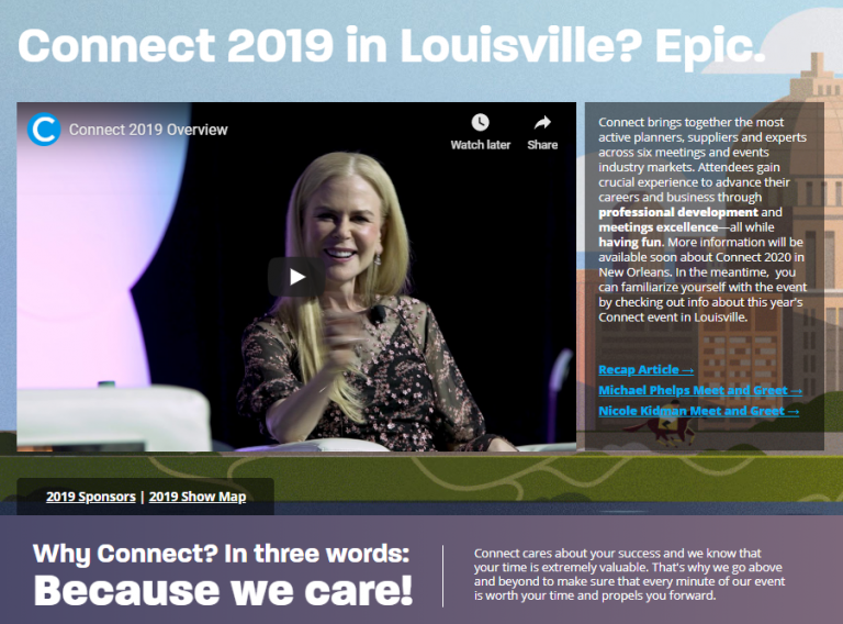
– Connect Landing Page

In this example, Nicole Kidman welcomes us as we “land on” the page, a social proof that creates trust, also gets our attention. At the bottom of the page, you can see they are offering us a brief reason why we should take the initiative.
– EVS33 Landing Page

Again, you can clearly see that the bright colors get our attention. There is enough information about what the page is about and it is designed to make you take action.
So far, we have looked at some of the landing pages with good attributes. The best landing page is the page precisely designed for your purposes and needs.
For more information on how to professionally design a landing page for your business, please don’t hesitate to contact Earnado!


